Wednesday 6 August 2014

The Finale

View of an Anhui Village (2007)
by 
Chua Ek Kay
Chinese Ink on Rice Paper, 97cm x 90 cm 

Villa Borghese (1960) by Willem de Kooning
Oil on Canvas, 203 cm x 178 cm

Hello, we are Chua Ek Kay and Willem de Kooning and today, we shall do a combined post as a grand finale.

Chua Ek Kay: Ever wondered why “View of Anhui Village” looks similar to “Villa Borghese” by Willem De Kooning? It is because I got influenced by Willem’s artworks. As you can see, the brushstrokes in “Villa Borghese” actually look similar to a traditional house in some Chinese rural villages. For instance, the blue paints might represent the roofs of some building while the green paint might represent the walls of that building. De Kooning’s composition also might have influenced me a bit as you can see that both or works consist of horizontal and vertical elements stacked on top of each other. Hence, I got inspired by the abstraction and decided to paint the houses in my painting in abstracted forms.

Willem de Kooning: But even though so, you can see that Chua Ek Kay has integrated some of his own style into “View of Anhui Village” For one, he used a completely different medium than what I used and I think it’s very unique! I mean, he used an “Asian” medium to render Asian houses while I used a “Western” medium to depict a famous public park in Rome when I was there quite a few years back. Another thing to also note is that Chua’s painting is his usual trademark black and white while mine is in colour. Colour is especially important for this particular painting of mine because it illustrates the Mediterranean feel I was trying to communicate to viewers; blue water, green grass and yellow sunlight. For Chua, I think it is partly because the village itself aren't that colourful to begin with but he also decided to keep it black and white because that is what's unique about his medium: Chinese Ink. He also rendered the village slightly more detailed than I do as you can see from the roof!

And this post marks the end of our blog. Thank you for reading and we hope to see you all again sometime soon!


Bless your heart and 再见!


Anhui Village, China
Villa Borghese Gardens, Italy

Wednesday 23 July 2014

Chua Ek Kay: My inspiration from Piet Mondrian


Chua Ek Kay 
Lotus Pond: Reflection, 2005
ink on paper
90 x 95 cm.


Piet Mondrian
Composition 10 Pier and Ocean, 1915
oil on canvas
85 x 108 cm


你好! Today, I will talk about one of my sources of inspirations, which is Piet Mondrian. As you can see, Piet Mondrian painted different compositions of Pier and Ocean, and I was motivated to incorporate western influences into Chinese calligraphy paintings. I mustered my courage to push the boundaries and created works that were not understood and perhaps rejected by society. 


When I was exposed to Piet Mondrian's works, Pier and Ocean attracted me a lot and so I got inspired to create a composition dominated with vertical and horizontal brushstrokes. The grid-like structure in Pier and Ocean is derived from an art movement called Cubism. As stated in the title of Mondrian's artwork, the painting solely depicts piers and the ocean in a highly stylized form that might not resemble anything in reality at first glance. However, upon closer inspection, one can see that the vertical strokes are the piers while the diagonals created by both the vertical and horizontal strokes are the waves, creating a sense of movement. Similarly in my artwork called Lotus Pond:Reflection, no distinguishable traits of a lotus are found. However, when one looks closely, he or she would realize that the brushstrokes vary in thickness. So, the thicker brushstrokes might be used to represent the lotus while the thinner and brushstrokes might be used to create the ripples of the pond. 

Despite similar painting styles, there are differences in our works. In Pier and Ocean, Mondrian's composition is contained in an oval format, while in my artwork, i chose to unify the picture's elements into a square. Furthermore, my painting seems more chaotic than Mondrian's artwork. In Pier and Ocean, Mondrian chose to organised his lines in an organised, grid-like system while in my painting, I painted the lines rather messily, adopting the principles of abstract expressionism. So, although my painting seems chaotic, the brushstrokes are expressive which captured the essence of the artistic process of creating art with ink. The vital brushstrokes capture life and meaning on paper. 

To conclude, although ink is a chines traditional painting medium, we all can use it and infuse western and chinese influences to create a whole new composition. 

Tuesday 22 July 2014

Willem de Kooning: Jackson Pollock and Me

Jackson Pollock. Number 1A, 1948. 1948
Number 1A, 1948 (1948)
by Jackson Pollock
172.7 cm x 264.2 cm
Oil and Enamel Paint on Canvas
Excavation (1950)
by Willem de Kooning
205.7 cm x 254 cm
Oil on Canvas
"Every so often, a painter has to destroy painting. Cezanne did it, Picasso did it with Cubism. Then Pollock did it. He busted our idea of a picture all to hell. Then there could be new paintings again."
 Yep. I respect Jackson Pollock. I find his work very refreshing and truly experimental.

I think that might be the reason why people think I'm trying to emulate his style then when I painted "Excavation" and "Attic". Well, I can't really say that Pollock's works completely didn't play any part in the creation of these pieces. Perhaps they did, on a subconscious level. But I really like to think that my work is... well, different from his.

Although I think I've said this before, my work is still figurative in some way. I didn't try to forsake figurative representation in the pursue of abstraction and instead, I created tension between them. It is quite apparent in my Women series paintings done a few years after this painting but this one, if you look closely, is also actually somewhat made in that same spirit.

Pollock however does try to really go abstract and try to be as non-figurative and as non-representational as possible. Why, he said it himself! I may have dementia but I remember he once said that, "Abstract painting is abstract. It confronts you. There was a reviewer a while back who wrote that my pictures didn't have any beginning or any end. He didn't mean it as a compliment, but it was." I was amazed.

Anyway, in case you are scratching your head because I said that this painting is still figurative, I will try to explain why I feel my painting is still figurative.

For one, at the very least my work still has a title. "Excavation". Nice don't you think? It may sound simple but it sure does spur a lot of curiosity and interest in guessing why I titled this painting as such. People might then get a general feeling or a vague idea about what I am trying to depict in the painting and, hey, their interpretation may not be right but at least my title allows them to analyse the painting with the figurative idea of an 'excavation' in their mind.

Pollock however, called this one 1A. That's it. Just that plain, ol' simple system of numbering. Why? Well... 
"Numbers are neutral. They make people look at a painting for what it is—pure painting."
So you can see that Pollock really seem to strive for the idea that a painting is to be viewed and judged for what it is, not for what it represents. A very classic example is how he freed lines from its role as a tool to render a subject matter to being the subject matter itself. I do not disagree with that view, and I can say that he shares that vision and motivation with a lot of other abstract painters both before and after him. That is very cool, I feel but that isn't what I'm trying to achieve with "Excavation".

My inspiration for "Excavation" is actually from this movie I watched: Riso Amaro, or, Bitter Rice, a 1949 Italian Neorealist movie. There's this one scene in the movie that got me ticking. If I remember correctly, there was this group of women working on the rice paddy. Generally speaking it's a beautiful rural village. That is why, if you look closely there are actually elements of recognizable things:

Do you see a nose and a mouth?

Can you see the rough outline of a flying bird?
At least make out the shape of its tail and its outstretched wings?
Yeah, so look closely! It's not your eyes tricking you, I did intend to include shapes of birds, fish and human facial features too.*

Pollock however as you have seen for yourselves painted 1A purely out of paint drips. There is really almost no recognizable feature you can see in his painting, apart from his handprints on the top right hand corner of the painting. And I don't think that is supposed to represent anything either, just a form of autographing his painting.

Colour and composition-wise, I also still feel my work is also still different from Pollock. 
Pollock's painting is almost uniformly crowded with lines and there is almost no part of the painting that stands out more than the rest be it by being painted with a contrasting colour or painted with more lines and texture. If I am supposed to list at least one pattern that appeared in this painting it is that everything's mostly concentrated in the centre of the canvas. All these gave his painting this very evenly distributed quality, where no one side of the canvas seems to be more packed than the other. I think this goes very well with his idea that a painting must be viewed as a whole, and for what it truly is; not just parts of it because they attract more attention.

For mine, you can see that I used blue, red and yellow to attract attention to different points in the painting. And if Pollock concentrated everything in the centre, I think I am quite the opposite. Nearing the edges of the painting I actually painted more lines and make it 'busier' than the centre of the canvas. But through these things, I ultimately made viewers focus on the centre of the painting and those colourful patches of area.

The two of us also used very unique techniques that's different from each other.

Pollock as you can see dripped enamel paint onto the canvas that he laid on the floor and it may even seem that he was 'painting' in the air before letting the paint fall and form the pattern you see on the canvas. His method was mainly about building up layers of paint.

I, on the other hand, build up layers of paint...and then scrape it. Paint it again then scrape it again until I am happy with it. Truth be told, that is on of the reasons why I call this painting"Excavation", because of the technique I used to paint it!

As such, although Pollock does to a certain degree still has control over what the paint forms on the canvas, I would like to think that I still have more control over the paint with my technique making "Excavation" slightly a bit more, how shall I say it, deliberate. This is in no way saying that my painting is better than his; just a point I think may be worth noting.

And that, people, is what I really think about when people compare this work of mine with Jackson Pollock's work! Bless your heart and see you again next time!

________________________________________________________
Disclaimer: This is just one possible interpretation. Other people/website may have a different interpretation. An example of another notable interpretation is that the piece is inspired by the booming construction in New York City during that time and Willem de Kooning is fascinated by it, thus the title "Excavation" as the construction sites were being excavated to create the foundations of buildings.

* I did not make that up, apparently de Kooning did incorporate such elements according to this site: http://www.artic.edu/aic/collections/artwork/76244

Sources:
http://www.moma.org/collection/object.php?object_id=78699

http://www.brainyquote.com/quotes/authors/j/jackson_pollock.html
http://www.artic.edu/aic/collections/artwork/76244

Friday 30 May 2014

Willem de Kooning: Picasso and Me

You can say that I was influenced by Picasso. 

 Oh, what am I saying, I was inspired by him! Even my friend Arshile Gorky was in awe of him. (See my previous post). The fact that Picasso founded the Cubist movement is such an amazing thing that earned him my respect. I’m quite sure he was the main reason why I ended up trying to also emulate that quality of having the subject or foreground blend with the background until you can’t differentiate them. And I’m quite happy that I’ve somewhat managed to do it now (despite the numerous tantrums and failures I’ve experienced) That being said, our works are actually still quite distinct from each other:


Woman I (1950 - 1952)
by Willem de Kooning
Oil on Canvas

Weeping Woman (1937)
by Pablo Picasso
Oil on Canvas

Firstly, I think it would be easier to mention the similarity between our works. You can see we’re preoccupied with drawing women at certain stages of our lives. And it’s also obvious that we’re…um… not exactly treating them kindly in our canvases. 

Another thing to note also, like I previously mentioned, Picasso influenced me on trying to make the edge between subject and background ambiguous so in my work, you can see how I tried to do just that. But that is pretty much where all the similarities end and the differences start! 

For one, the way we paint the women’s figures is different. Picasso, being a cubist, of course relies on heavy black lines to delineate the forms and shapes that create the woman in the painting. The forms and the shapes itself are highly geometrical with many sharp angles and edges. Me? I would like to describe my lines as being more…”organic” in a sense. Those lines are anything but solid and instead, are smudged and mixed with each other. 

Picasso also disfigures the woman in the painting by skewing the face symmetry, highly simplifying yet at the same time stylizing features and squashing perspectives. I, however, exaggerated features of the woman: her eyes, her teeth, her mouth, and her bosom. And while you can still somewhat roughly identify the entire woman’s body part in Picasso’s painting, in mine you just can’t make out certain parts. Her hands and arms are totally obliterated by splashes of color and her left leg is also already blending to the background. 

On color palette, Picasso uses very garish, contrasting flat colors making the painting look very disjointed because the individual geometrical shapes seem to be accentuated. I, however, decided to paint it in a rather muted palette in comparison and if you look closely, I do have a bit of shading to bring out the three dimensionality of the subject. Although I used red, green, blue and yellow, their tones are somewhat grayish and since there are indeed a lot of gray in my painting, the colors and elements in the painting are somehow unified. I think all these differences may be accounted to the different intention we have when painting. 

For Picasso, it is to try and depict how much pain, suffering and grief can be expressed through the human face. He based this on one of his mistress’ face, Dora…Marks? Mare? Maar? I can’t remember her name. Argh. Dementia’s acting up again. I think it is Dora Maar. (edit by Chua Ek Kay: Yes, it’s Dora Maar, people.) He keeps on saying, "Dora, for me, was always a weeping woman....And it's important, because women are suffering machines."

On the other hand, I paint because of lust. Unlike Picasso, I can’t remember who that lady was but I can tell you she was one pretty lady. *drools* 

Erm, but anyway, I set to do this painting and did what I did. You can say this is an expression of pent-up sexual frustration but if there’s anything “Woman I” did to me it is that it eliminated composition, arrangement, relationships, light, because that motif was the one thing I wanted to get hold of. I thought I might as well stick to the idea that it's got two eyes, a nose and mouth and neck! Okay, you ladies out there might be thinking very low of the two of us right now. I…can’t say we’re not guilty but trust me, when we love a woman, we respect them...


Portrait d'Olga dans un fauteuil
Portrait of Olga in the Armchair (1918)
by Pablo Picasso
Oil on Canvas


Portrait of Elaine (1940)
by Willem de Kooning
Pencil Sketch

...because any male artist should think twice, or even more than that, before he decides to make his girlfriend look disfigured in her portrait! Hell hath no fury like a woman scorned!

That is all for now from me. Bless your heart, readers!

Wednesday 28 May 2014

Chua Ek Kay: Comparison between Chua Mia Tee and My Works

Chua Ek Kay
Old Street Scene - Chinatown
Chinese Ink on Paper, 69 x 78 cm
Chua Mia Tee
History of Human Spirit (1983)
Oil on Canvas

Both Chua Mia Tee and I painted the Chinatown scenes. There are some similarities as well as differences between both artworks.

The both of us have similar thematic concern. For Chua Mia Tee, the Chinatown scenes are vivid memories from his childhood and he wanted to document these scenes before they get forgotten and vanish from the urban landscape. Similarly, "The streets and lanes hold fond memories of my childhood as well as dreams of my present and future". So, i wanted to paint the "old Singapore streets, with their varied architecture and suggestion of a way of life gradually fading into the past, into tropical decay, or encroached upon by modern high-rises". Therefore, both of our works are inspired by our childhood memories and hold similar intentions.

We used different mediums to paint our artworks. In "Old Street Scene", I painted the Chinatown scene using Chinese ink while in "History of Human Spirit", Chua Mia Tee used oil paint to paint his work. The use of ink, a Chinese traditional medium, creates a black and white effect, to portray a scene back in the olden days. Moreover, Chinese paintings often make use of positive and negative spaces and this effect produced is similar to that of the black and white photographs in the past. On the other hand, Chua Mia Tee used oil paint to paint his work but he managed to create a sepia effect through the warm hues. So the painting looks vintage too. Therefore, although the mediums both artists used are different, both artworks are able to create a vintage effect.

Also, both of our paintings depict subject matters differently. For example, in my painting, the painting is devoid of human presence. However, in "History of Human Spirit", human figures are depicted engaging in their daily routines or activities. Even though i did not paint any human figures, I painted dark doorways in the foreground which implies activity beyond the doorways. So these black patches serve as an abstraction of the human activities or engagements. On the contrary Chua Mia Tee painted people in the midst of their activities. The people seem oblivious of being painted as Chua wanted to capture the moment of a typical Chinatown scene. Therefore, the subject matters in our paintings are depicted differently since the subject matters in my painting are abstracted while the subject matters in Chua's painting are painted realistically.

Lastly, the perspective of our works are similar. Both of our works depict an atmospheric perspective, where the subject matters are not painted clearly at the background to show a vanishing point. This creates depth in our work. In addition, subject matters diminish in size in the background.

In conclusion, there are similarities -- the perspective, thematic concern and choice of subject matters-- but these are painted differently. I have adopted the Chinese traditional ink painting while Chua is influenced by the western art and he chose to use oil paint. Therefore, the visual impacts differ.

Monday 12 May 2014

The Beginning of an Artist's Journey | Chua Ek Kay

你好,I am Chua Ek Kay. Since young, I always have a deep interest in listening to music and reading Chinese literature and poems. I remember that back when I was in Catholic High School, I could recite poems from memory and my teachers would be very proud of me.
As mentioned earlier in the previous post, I did not come from an affluent family. That was why I only started learning traditional Chinese ink painting when I was 28 years old. My Master was Fan Chang Tien and his valuable lessons have taught me how to fuse poetry with calligraphy in the painting and use "expressive ink", to be expressive in whatever subject matter I choose. I remember that he once said, "There must be rhythm within each stroke and each dot. There must be a graduation of black within black." His teachings are etched in my memory and as you can see from the painting of the bamboos on the left side, the black ink is carefully mixed with water and the colour gradually fades from the bottom to the top of the bamboo. 

Fan Chang Tien's Bamboo Painting
(99cm x 35cm)

Chua Ek Kay's bamboo paintings


Not long later, I decided to pursue my studies at University of Tasmania to widen my horizon of western concepts in paintings. I was deeply fascinated by the new avenues of thoughts, approaches and techniques that Western art offered and so, I went back to school (LASALLE) in Singapore to study. My thinking had broadened and I realised that a brush is a very important tool of universal language for I am able to manipulate it to apply brushstrokes that can express my emotions with grace and confidence indecisively. I felt so overwhelmed by the power of brushstrokes and was emotionally compelled to just paint with freedom and that was when I painted one of my most personal piece of work Song of Cicada.


Song of Cicada (1995)1800 x 3600 mm X 4 幅
Song of Cicada is a very simple yet complex work. The work appears simple as each of the scroll is painted with not more than two leaves, which creates vast areas of empty spaces. The concentration of white, empty spaces represents the serene, calm and quiet state of mind I possess. However, despite the emptiness of the painting, there is a certain intensity exuded, bewildering the viewers  and inviting them to imagine and envision experience from within the painting. So, although this work might seem simple on the surface, it is actually a complex work charged with my sentiments and intentions.

Basically, I spent decades learning and practising Chinese ink painting in the inception of my life as an artist. Now, it is time for me to stop writing and I will end off with a quote, "Without a strong foundation in calligraphy, where will your artistic lines come from? Without reading, how can you conceive art? Without good learning, how can you be an expert?"

Saturday 10 May 2014

The Beginning of an Artist's Journey | Willem de Kooning


Hello, Bill here!

Some of you may be wondering how I ended up becoming an artist. Truth be told, I am still quite amazed at how life had unfolded for me. My journey was not a smooth one.

My first encounter with art was when I was 12. Quite a late age don't you think? I became an apprentice at this firm called Gidding and Sons in the heart of Rotterdam. They're a bunch of talented artist and craftsmen who specialized in design and decoration. Despite the amount of talent concentrated there, somehow I managed to grab the attention of the owner but for the life of me, I can't remember his name anymore. That's a shame since I am forever indebted to him - he's the one who convinced me to really join the Rotterdam Academy of Fine Arts and Techniques. Thank you kind sir.

So the next chapter in my art journey began. I was studying in the academy and I considered myself very lucky: I've learnt about commercial design from the time I worked as an apprentice and now I got to learn about the more refined principles of high art. Below are a few paintings I did as a student. Ah, the memories...


Still Life (1916/17) by Willem de Kooning
34.3 x 38.1 cm
Oil on Cardboard
The painting I did when I was 13 years old 

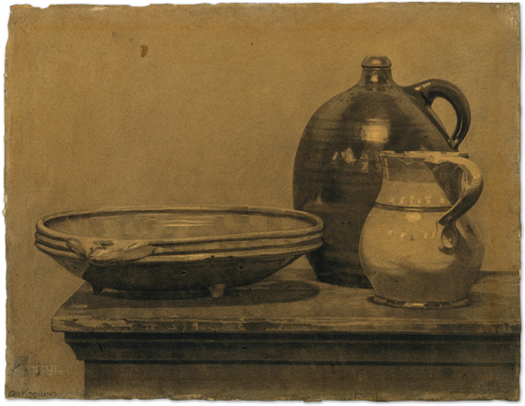
Still Life (Bowl, Pitcher, aand Jug) (1921) by WIllem de Kooning
Did this 4 years later. Still very proud of it!
And...as you all know, I hid in a British freighter ship to go to America in 1926. It's not really because I thought America was the place for artists though, mind you. In fact, quite the opposite, I never even once considered America as having any serious artist at all. I just wanted to go to the US because it sounded cool. (I was young, okay?)

As it turned out I'm quite mistaken. There were indeed serious artists but almost all of them were poor. But that's what fascinates me; their devotion to the arts. There's one more thing that finally convinced me to become an artist though. I've told you that I met a lot of artists, but then I met Gorky. Arshile Gorky, to be precise:

File:Archives of American Art - Arshile Gorky - 3044.jpg
"If you were serious, you studied the work of modernist masters such as Picasso, Matisse and Miró, and you aspired to equal or better their achievement," he said last time. Whoa.


And that was how I finally became a full-time artist. 
However, his modernist ideas, which I really admired, clashed with my classical training, which I also quite like so that was a horribly rough period for me. You can ask my friends (or perhaps the garbage man) how many canvasses I threw out last time.

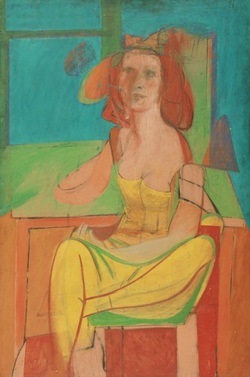
Then, along comes Elaine:

Portrait of Elaine (1940) by Willem de Kooning
"I was a lot of fun," Elaine said in an interview quite recently. "I mean a lot of fun."
And yeah, I can't agree more.
I guess the two of them had a significant impact on my works. Gorky planted the idea of departing from classic art convention, and Elaine was the one who finally gave me the courage to do so:


Seated figure (male classical) - Willem de Kooning
Seated figure (male classical) (1939) by Willem de Kooning
Picture
Seated Woman (1940) by Willem de Kooning

Standing Man - Willem de Kooning
Standing Man (1942) by Willem de Kooning
Queen of Hearts - Willem de Kooning
Queen of Hearts (1943) by Willem de Kooning
Somehow I managed to delve into the realm of abstraction yet still pay homage to the old masters by keeping a clear reference to the human figure in my paintings of these period.


File:Master-bill.jpg
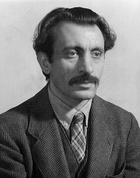
Portrait of Master Bill (1929 - 1936) by Arshile Gorky
You see how Gorky influenced me?
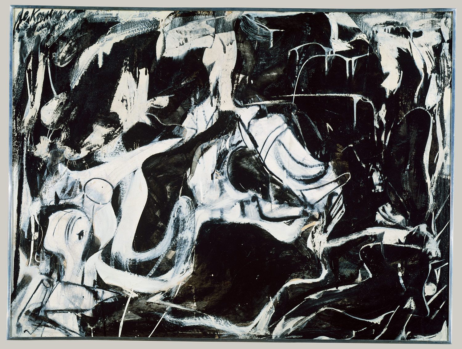
But then, things went down the drain. I was broke, World War II happened, The Holocaust happened and Rotterdam, my city of birth, was reduced to rubble. At that very frustrating time period, I, together with my friend Franz Kline, went to buy black and white enamel household paint (read: too poor to buy anything else) and just vent. Like really, we just went cuckoo.
Dark Pond (1948) by Willem de Kooning
Enamel on composition board

Black Untitled (1948) by Willem de Kooning
Oil and enamel on paper

Untitled (1948) by Willem de Kooning
Oil and enamel on paper

But I think something good did come out of it in the end...I had my very first solo exhibition that year at the Charles Egan gallery. Not a big one, and only a few paintings were sold but at least it got people talking about me.

I decided to explore this style further and was a bit pleasantly surprised that people compared me to Jackson Pollock:

Attic (1949) by Willem de Kooning

Excavation (1950) by Willem de Kooning

But I still feel that my works still bear more 'resemblance' to the real world than Pollock's work and that is not necessarily a good or a bad thing. I respect Pollock. Every so often, a painter has to destroy painting. Cezanne did it, Picasso did it with Cubism. Then Pollock did it. He busted our idea of a picture all to hell. Then there could be new paintings again.

But for me, even abstract shapes must have a likeness.  I just feel that I'm more suited to draw human figures and so, to the surprise of a lot of people, I ditched black and white paintings and focused back on human figures. Or maybe to be precise, I should say, women: 

Woman I (1952) by Willem de Kooning
Woman II (1952) by Willem de Kooning
Woman III (1953) by Willem de Kooning
And that I guess somewhat summarizes my journey of being an artist. Even though the Women series may seem to be my most popular series, I did not stop there. I continued experimenting in many, many different styles. With my dementia nowadays, it would be difficult for me to tell you why I painted certain paintings that way. All I can say is that after the Women series I paint with bolder and less messy lines. Sometimes completely random things inspired me too such as... 

Highways:
Montauk Highway (1958) by Willem de Kooning
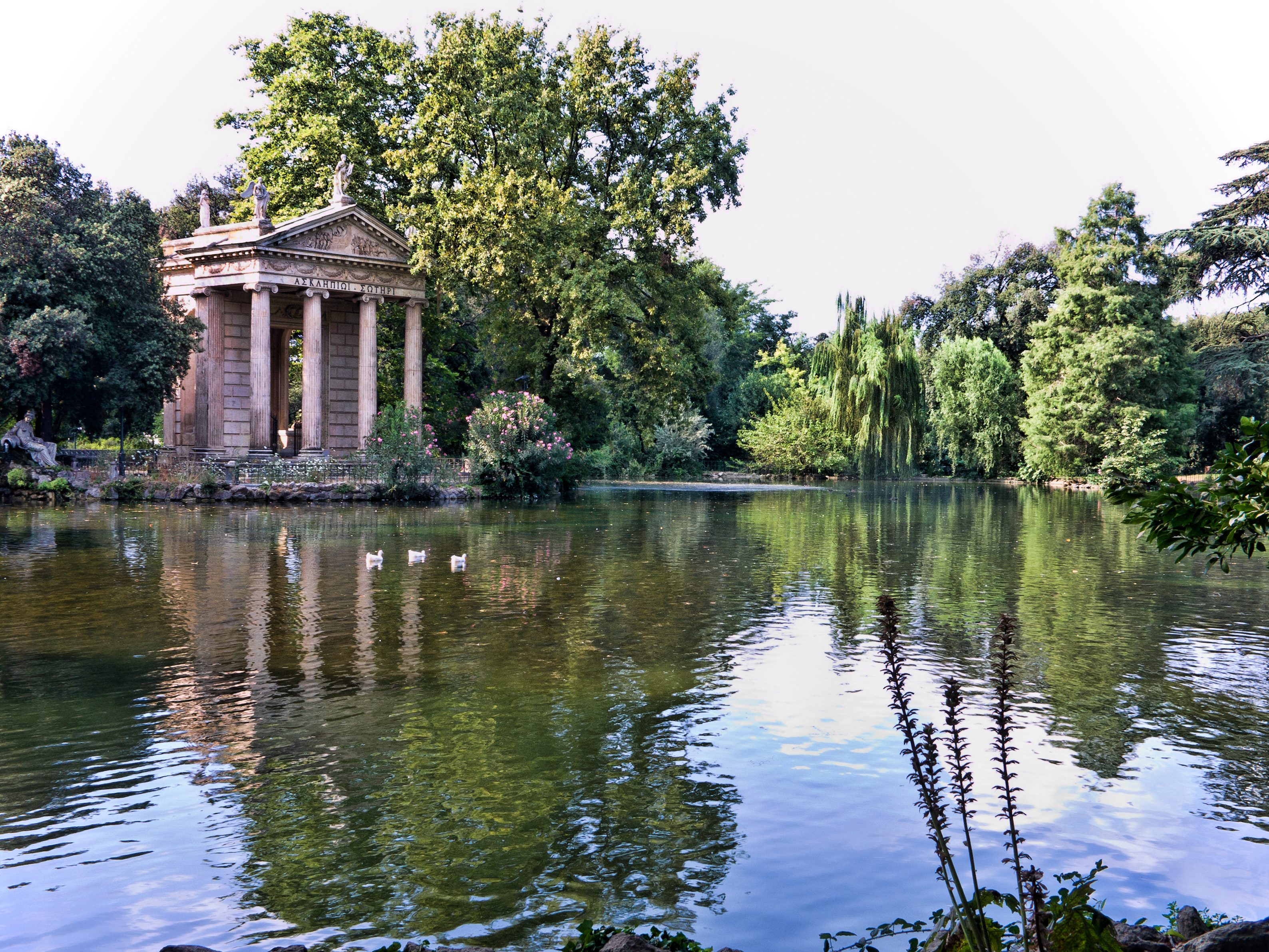
A Mediterranean Garden:
Villa Borghese (1960) by Willem de Kooning
Or landscapes:
Untitled (Landscape) (1977) by Willem de Kooning
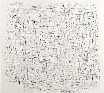
And now, as old age and diseases are starting to affect me, my painting style once again changes. Much much cleaner if you compare them to my earlier works:
Untitled XII (1985) by Willem de Kooning
Untitled (1988) by Willem de Kooning
My journey never stops. I always evolve from time to time. 
That is all for now, everyone! Bless your heart and see you next time!


sources:
http://www.smithsonianmag.com/arts-culture/willem-de-kooning-still-dazzles-74063391/?page=1

http://arthistory.about.com/od/artistsaz/a/Artists-Quotes-Willem-De-Kooning.htm